.jpg.jpg)
4 inspiring examples of ecommerce UX

The ecommerce space shows no signs of slowing down. Forrester predicts that by 2027, US online retail sales will reach $1.6 trillion, accounting for almost 30% of all US retail sales. While ecommerce has been around for decades, its uptick in recent years can be attributed to consumers’ growing need for convenience, social commerce, and increasing payment and delivery options—from curbside pickup to the buy-now-pay-later structure.
As organizations work to keep up with demand and evolve with industry changes and uncertain market conditions, there’s no sign of a reprieve just yet. Consumers’ expectations are higher than ever—with calls for fast delivery, price matching, vast product selection, high personalization, stellar customer service, and more.
While organizations can’t predict every shift and change that lie ahead, a critical factor we can control is user experience (UX), which can make all the difference between customer loyalty and churn. If you want to thrive in a commoditized, algorithm-driven ecommerce environment, prioritize offering a seamless experience—from when your customers initially discover your products to when they become advocates for your brand.
Table of contents
- Why is UX important in e-commerce?
- Key UX statistics to know when planning, or re-designing, your ecommerce experience
- What your ecommerce business needs for a positive UX
- Ecommerce UX examples to use for inspiration
Why is UX important in ecommerce?
When was the last time you abandoned an online shopping cart? You may be leisurely adding items you were interested in but had no serious intention of buying, a habit known as digital window shopping. Or, you got overwhelmed after seeing all the costs add up in the checkout process. While consumer budget and intention may be beyond an organization’s control, what you can actively prevent your consumers from experiencing is the following:
- Forced account creation with no guest checkout option
- An overly complex checkout process
- Security and privacy concerns
- Slow loading speeds or other performance issues
- Lack of mobile-friendliness
- Distracting ads or pop-ups that slow down or prevent task completion
All of the above friction points and more make up a poor UX. These factors lead to abandoned carts, the rate of which hit 80% in 2022 in the U.S.—damaging conversion rates and making customer acquisition pricier. Customers know they have the upper hand—they have almost limitless product selection while the list of your competition grows longer. And with 46% of customers unable to differentiate between most brands’ digital experiences, practicing customer-centricity and prioritizing your UX is one way to ensure you’ll stand out.
Key UX statistics to know when planning, or re-designing, your ecommerce experience
- 35% of money is left on the table due to poor ecommerce UX, translating to $1.4 trillion lost
- 70% of consumers say that page speed influences their willingness to buy from an online retailer
- The majority of first impressions are design-related
- Brands risk losing 38% of customers from poor marketing customization efforts
- 46% of customers can’t differentiate between most brands’ digital experiences
What your ecommerce business needs for a positive UX
To boost conversions, consider the following list, which isn’t all-inclusive:
- Weave usability testing, like with the UserTesting platform, into each stage of your development process
- While an online business doesn’t have to be paired with a brick-and-mortar store, every brick-and-mortar store needs a website
- Leverage UserTesting templates on social commerce, inflation and customer perception testing, shopping cart experience, and Black Friday to guide or inspire your studies
- Product description pages that answer all of your customers’ questions—without them needing to talk to a live agent or dial customer support
- A variety of customer service options, from email and live agents to call center representatives
- An optimized checkout process with guest checkout option
- Email campaigns to follow up with users who abandoned their carts
- Consistent performance on both desktop and mobile
- Transparency when it comes to fees and costs
- Personalize the experience for customers, but know when it’s too personal
Ecommerce UX examples to use for inspiration
To see what’s being done right and what you could be doing better, get inspiration from these positive ecommerce UX examples below.
1. Bonnie Plants’ product pages
Multinational corporation Scotts Miracle-Gro specializes in consumer lawn, garden, and pest control products and has primarily sold items at brick-and-mortar stores. Realizing they needed to make adjustments after increasing online sales, the organization turned to UserTesting to improve buyers’ online experiences.

One of their emerging brands, Bonnie Plants, was prioritized for optimization after being launched during the pandemic. Its product pages check all the boxes regarding detail, ease of use, a persuasive CTA, and imagery. We’ve all experienced product pages that offer too little information, and Bonnie Plants ensures customers can find everything they need without having to leave the page.
And while buying and caring for plants can seem intimidating for beginners, Bonnie Plants’ product descriptions make this a seamless purchase for all types of buyers with its growing guide, unboxing steps, long-term care instructions, and customer reviews.
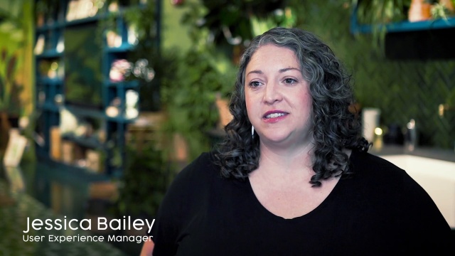
Previously, Scotts Miracle-Gro relied on traditional user research, which was significantly more time-consuming and expensive. Now, their teams’ boost in productivity is leading to an estimated ROI of 477%. Watch the following video for more on their story and collaboration with UserTesting.

2. Thrive Market’s product “values”
Online grocery marketplace Thrive Market simplifies healthy living. One of its major selling points is that it offers foods and products that accommodate a variety of diets, allergies, sensitivities, and more. Of course, this had to be reflected in their UX, so consumers don’t have to waste time digging for the fine print on whether something is gluten-free or certified organic—or worse, leaving for another site to get the necessary information.
If you’re looking to discover new products but not sure where to start, Thrive Market makes it easy by offering various search categories, including:
- Diets
- Certifications and awards
- Health and ingredients
- Environmental and social
- By concern
While many grocery retailer sites allow you to zoom in on Nutrition Facts labels, Thrive Market offers a more user-friendly option. Once you click on a specific item, each value it represents appears on the product page, leaving you with no guesswork or questions.
3. Sephora’s “Voice Search”
We’ve all become increasingly accustomed to voice-activated technology, from voice messages, Apple’s Siri and Google Assistant to Amazon Alexa. Products like these have paved the way for better accessibility and convenience, especially for consumers with disabilities. With just one word or phrase, we can access today’s weather, a store’s hours, or a phone number, among infinite possibilities.

And voice assistants have now found their way into the ecommerce UX, with Sephora adding a voice search functionality into their mobile app experience. Consumers only have to speak out loud, whether they’re looking for what’s trending or popular or specific items—saving time and clicks when shopping.
And that’s not all. Sephora takes the search bar a step further by offering an option to “scan barcode.” This feature comes in handy if you’re shopping in person and are interested in reading customer reviews and ratings on the spot, especially if there’s no sales associate available. This design is just one way the brick-and-mortar experience bridges with the digital space. While these functions may not be for everyone, they offer options and freedom of choice.
Two retailers may offer similar products and similar price points, but when it comes down to who a consumer chooses, the brand that comes out on top is the one that offers the most user-friendly experience.
4. Lush’s “Bring it Back” program
The retail industry inevitably comes with waste, whether in the form of packaging, returned or discarded goods, or shipping resources. Despite consumers’ expectations of fast and free delivery and returns, sustainability is becoming more top of mind. In a 2022 Forrester report, 38% of U.S. online adults stated that in the past year, it’s become increasingly important for them to buy from organizations that prioritize sustainable items and practices.
The awarded retailers are actively adopting more eco-conscious practices—not just for customer adoption and loyalty but because they care as much as their buyers. Brands are adopting practices like offering recyclable and reusable packaging, minimizing plastic and paper use, planting a tree with each purchase, or providing carbon-neutral shipping options.

British cosmetics retailer Lush first launched a pot return program in 2008, where consumers would earn incentives for returning five clean pots of products they’ve finished. But after evaluating average returns, the brand found that the rate was much lower than expected. After collecting customer feedback, Lush realized that the five-pot number was too high for some buyers and became a participation barrier.

Revamping the program to boost return rates, Lush now offers the same incentive as a discount for returning one pot—allowing the retailer to give old pots a new life as future products. Lush offers thorough terms and conditions and insight into the recycling operations of this program on their site. These explanations offer buyers better transparency into the brand’s processes and values and solidify Lush as a brand they can feel proud to support.
Better understanding your customers
While we can’t always predict how customer preferences will change, there are universal CX principles that can shape our products and services. Ten years from now, our customers will likely continue to say:
- I’d like it to be easy to find something on your site
- I want reassurance about your site’s privacy and security measures
- I’m hoping for a quick checkout process
Continue to ask yourself—what’s the end result that your customers absolutely require? What kind of experience would they prefer to have as they go through the process of getting that result? And how can you seamlessly deliver an excellent experience for users while removing the pain points they currently have to endure?
All of the above questions can be answered with frequent usability testing from your target shoppers. Preparing for the next industry shift while maintaining consistent CX needs will make all the difference in an ecommerce product that becomes stagnant or goes the distance.
Further reading: How to build an ecommerce website
In this Article

Get the guide
Get the guide


