A guide to user onboarding techniques for mobile apps

Because of the rising cost of user acquisition on mobile apps, retaining users is more important than ever.
The problem is that 80-90% of apps are deleted after being used once.
If users don’t understand how to use your app, they won’t use it.
To make sure your users don’t delete your app after one use, you need to successfully onboard them. That means helping them get their bearings, teaching them how to complete key tasks, and making them want to come back for more.
In this article, we’ll walk through six different patterns for user onboarding.
Note: some of the most successful apps use a combination of these techniques to make sure their users don’t miss out on any crucial learning moments in their first-time user experience (FTUE).
Coach screens
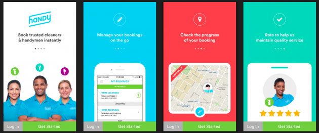
What they are: A series of interstitial screens that appear when the user opens the app, explaining its purpose and features.

Source: UX Archive
Pros
- Well-designed coach screens reinforce the value proposition of the app. They remind users why they’re there in the first place—and maybe even show off some benefits they weren’t aware of.
- You can use them to introduce the core loop or function of the app... while leaving the details up to the user’s exploration.
- They’re super simple and common, so users are used to interacting with them.
Cons
- It’s easy for users to skip through instructions and ignore them (or forget them).
- Too much content can make coach screens overwhelming.
- Users can get confused if the coach screens look like interactive tutorials.
- If the core loop you’re explaining is more than a few steps, the user will be likely to forget the first step.
Tips
Keep it to a few quick screens. 3-4 tends to work well.
Use your visual design elements strategically to set their expectations of your brand. This is your opportunity to make an awesome first impression.
Use benefits-driven language rather than just explaining features. Remind them of how this app will make them a happier, better, more successful version of themselves.
Try to use as little copy as possible. (Remember, users tend to scan and then forget longer chunks of copy.)
Make it clear that the only thing the user needs to do is swipe to the next coach screen.
Interactive tutorials
What they are: Hands-on walkthroughs that guide users through the key features and functions of the app, allowing them to learn new actions as they go.
Pros
- Learning by doing can reinforce patterns, putting less burden on the user to remember what they need to do. That means there’s a lower chance they’ll forget how to perform key actions.
- Users stay in a single workflow, which can be more engaging than bouncing back and forth between instruction screens.
- Because users have the opportunity to take the action right away, you usually don’t need to use much copy to explain what to do.
Cons
- Tutorials can be frustrating for users who just want to jump in and get started. This includes folks who previously used the app on a different device, have a different account, or are just fast learners.
- If the learning curve on the tutorial is too steep, novice users can get lost and drop off.
- Since users are actually taking the actions, there’s a chance they’ll make mistakes, like deleting important information or accidentally sending a message to someone.
Tips
Leave an option for users to skip the tutorial if they want to go straight into the app. To make sure that users who choose to skip the tutorial don’t get lost, incorporate other tactics, like a prominent help menu or tooltips, to provide broad guidance.
Make sure it’s easy for users to undo actions in case they make mistakes.
Focus the tutorial on the most important and common actions users will take—don’t try to cover every single feature.
Don’t overwhelm users with too much copy. Try to keep it extremely concise while still clear.
Tooltips
What they are: Overlays or callouts that appear in certain parts of the user workflow, containing helpful hints about less intuitive features.

This tooltip appears after you record your first video clip in Vine.
Pros
- These tips only appear when you want the user to see them, so you can introduce more complex functions at the appropriate time. You can set usage triggers so only the users who take a specific action see the hint.
- They’re good for introducing unfamiliar icons, features, and concepts without taking up permanent space on the screen.
- They’re great at capturing the user’s attention and pointing out elements they may have missed otherwise.
Cons
- It can be overwhelming if there are too many tooltips on the screen at once.
- It’s tempting to use them as a substitute for intuitive design. It’s better (but not always possible) to design an interface that needs no explanation, so don’t get lazy and rely too much on tooltips!
Tips
Timing is everything. An appropriately placed tooltip can provide crucial information at the exact moment the user needs it. Make sure to user test the first-time user experience so you understand what questions users have—and when.
Keep it to one tip at a time so you don’t overwhelm users with too much new information.
Make sure users have the option to close or hide tooltips if they don’t want to interact with them.
Progress bars
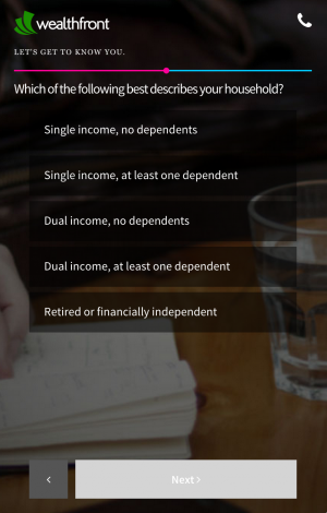
What they are: Visual indicators of how close the user is to completing their onboarding process.

This progress bar shows the user how far along they are in the introductory questions of the onboarding flow.
Pros
- Having an indicator of progress can encourage users to complete all the steps of the tutorial. It provides a sense of reward and accomplishment for learning how to use the app—and it gives users a light at the end of the tunnel.
- According to First Round, adding a progress bar can increase conversions up to 40%.
- It’s a great technique for mobile games that rely on rewarding users to encourage them to keep playing.
Cons
- Progress bars are occasionally used as a dark pattern. For example, maybe the final step to complete the progress bar is an action the user may not be ready (or ever want) to take, such as linking their Facebook account or filling in credit card information. If they choose not to take the action, they’re stuck with a partially-complete progress bar forever.
- It can be daunting if there are too many actions users need to take, and they feel like they’re not making progress fast enough.
Tips
Make sure each step in the progress bar drives the user to achieve a specific goal, and that goal is actually useful to the user.
Choose a small enough number of steps that each step shows visible progress on the bar. A jump 50% to 52% is not as encouraging as a jump from 50% to 75%.
Add an ideal time frame for completion so users will pace their progress appropriately.
Email lessons
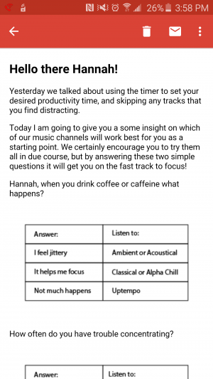
What they are: A series of emails you send to new users to help them learn more about your product.

I got this helpful message on picking the right music station as part of a series of onboarding emails from Focus@Will.
Pros
- Email tips are good for apps that are easy to learn but hard to master. You start users off with simpler features and introduce them to slightly more advanced features with each email.
- Email notifications keep your app top-of-mind for users and can dramatically increase engagement.
- You can use emails to address some of the pain points users may be feeling as they master the learning curve of the product.
- You can build the relationship between the user and your brand with the helpful and engaging content and tone of your emails.
Cons
- Not everyone is going to open and read the emails.
- People often sign up with fake email addresses, and others unsubscribe right away. Those folks will miss out on your tips.
- Too much email can overwhelm and irritate your users.
- Planning, writing, editing, and setting up the emails can be more time-consuming than other onboarding techniques.
Tips
Don’t rely exclusively on email to onboard users. It should be a supplement to in-app onboarding techniques because some users may never read the emails.
Plan out your email flow in advance and pay special attention to the cadence and length of the series. Match your email frequency with the amount of time it will take users to learn the lesson and become ready for the next one.
Identify parts of your product that are particularly difficult or confusing to users, and use your emails to help them resolve those problems.
Training videos
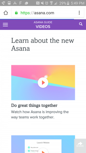
What they are: Brief videos that give users the tour of the product and demonstrate certain workflows.

Asana offers really good, thorough training videos on their help center.
Pros
- Videos can be ideal for business apps like CRMs and project management tools that require multiple team members to use the product in the same way. Plus, they're ideal for products that have both desktop and mobile versions that are meant to be used differently (like Asana, pictured above).
- Videos allow you to cover more ground and get more in-depth into complex features. You aren’t restricted to a single screen and a few words of copy to teach users how to perform an action.
- Users can watch whichever videos they like, as many times as they like.
Cons
- Training videos often exist outside of the app, so users have to go out of their way to watch them. That means a lot of users will never see the content.
- Video can be frustrating for users with slow internet connectivity (or no headphones).
- High-quality training videos can be expensive and time-consuming to produce.
Tips
Don’t try to accomplish everything with one video. Let users cherry-pick which lessons they want to watch. Long, exhaustive videos will wear users out, and they’ll be more likely to forget key information.
Videos shouldn’t be the only way for users to learn their way around your product, and they shouldn’t be a substitute for intuitive interface design.
Don't forget to make your videos mobile-friendly so users don't have to switch devices!
For successful onboarding, user feedback is key
What seems obvious to you may not be obvious to your first-time users. That’s why it’s so important to collect (and listen to) feedback and find out where users get confused in the FTUE.
If you want to make sure your interactive tutorial contains all the right information, run a few quick user tests and see if users understand what to do after they complete it.
If you send a series of email lessons, read the replies. You’ll get to see what questions people are asking and build empathy for the user.
Whatever you do, use this feedback to improve your onboarding experience on an ongoing basis.


