6 techniques for improving the UX design of your mobile app

Most of us spend 3 hours and 8 minutes per day staring at our smartphones in a universe filled with millions of applications and websites attempting to capture and retain our attention. And the apps we spend most of our time on have one thing in common: they’ve successfully created an engaging and intuitive user experience. In fact, more and more companies are now realizing that user experience is the true competitive advantage which sets the best apart from the rest.
However, as we all know, it’s easy to champion the user experience in theory, but in practice, product managers and UX designers must account for an ever-rising number of complexities making their way into every project. These 6 UX principles will help mobile app development teams ensure that the final product is useful, usable, and engaging.
- Put your users — and their goals– first
- Serve bite-sized chunks of content
- Bigger is better
- Less typing is easier on mobile
- Get a handle (literally) on things
- Always test everything you build and look for ways to improve it
Let’s cover each section in more detail.
1. Put your users—and their goals—first
A large number of mobile apps today have been designed with the primary goal being the completion of the business goals of the organization that designed the app instead of the goals the user needs to do to complete a task. Not until fairly recently did online and mobile teams move away from a mentality of checking a box with their mobile products.
Many companies are finally realizing that true business success comes as a result of putting the user first: understanding the mobile app from a user’s point of view, empathizing with the user’s needs and desires, and building the product based on what users need, not what the business wants.
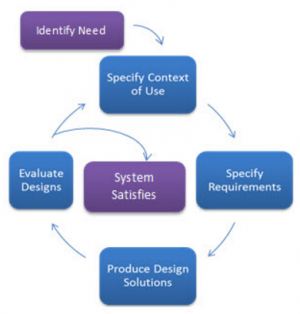
The best way to achieve a great user experience is by following a user-centered design (UCD) process throughout design and development while focusing on gaining a deep understanding of who will be using the product and what their goals are. The International Organization for Standardization (ISO) uses this standard, ISO 13407, as the basis for many UCD methodologies.
Via: Usability.gov
This iterative process involves a deep understanding of the product’s users and their goals, needs, and environments.
Note that this graphic focuses on the user’s goals, not the tasks the user has to perform. In other words, your users shouldn’t have to change their attitudes and behaviors to learn how to use the system you designed for them based on what you want people to do. Your goal should be to create experiences that are so seamless that the user doesn’t have to think about what they’re doing and how they’re navigating through your application.
2. Serve bite-sized chunks of content
A simple UX practice stipulates that users are more likely to continue using your site or mobile app if you group pieces of content together into digestible chunks. Especially on mobile apps, if you don’t follow this practice, users may struggle to find the information they need or struggle to complete a task.
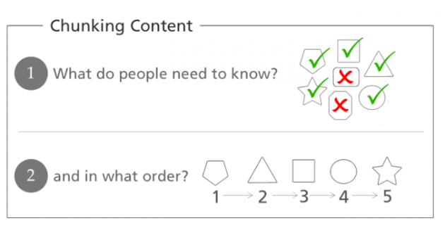
That is why companies must pay close attention to how information is structured and presented to the end user. When dividing content and tasks on your mobile app, ask yourself two things: What do our customers need to know, and in what order do they need to know it?

Via: Bethany Lankin
You have probably encountered an online checkout process that was a series of steps or chunks. The chunking principle becomes crucial for mobile designs because you don’t want to overload your users with too much complexity or too big a task at one time. Each step should focus on one thing only.
You may have heard that users want experiences with as few steps as possible, or that information should be no more than three clicks away; however, this is a myth. More steps in a process do not frustrate users if the steps are simple and easy to follow. It’s better to err on the side of many easy steps than fewer, more complicated ones.
3. Bigger is better
Making the elements of your site larger for display on a smaller screen may seem counterintuitive, but the truth is, you must make text, buttons, and other controls larger because of the limitations of people’s vision, dexterity, and finger size.
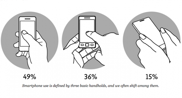
Thumbs drive 75% of all phone interactions, even though our fingers are more dexterous and we have better control of our screens when we use them.

Via: A List Apart
As Fitts’s law has proven, smaller targets are harder for users to hit than larger ones. A tiny button or text link is far more difficult for people to activate on their first try because these targets require more accuracy to hit. This is accuracy your users might not have in conditions where their dexterity is compromised (while they’re walking, when they’re tired, when they’ve had a couple of drinks when it’s cold and their fingers are stiff while lighting conditions are poor and, yes, while driving). Any of these factors, when combined with a small target, force your users to work much harder to hit their target. The rule of thumb is to never use a font size less than 16 pixels and use a line height of at least 1.5 to give users the feeling of readable text.
4. Less typing is easier on mobile
Users make far more errors and are significantly slower when typing on a mobile keyboard than when using a full-size desktop or laptop keyboard. As a result, users want to keep the slow and painful process of typing to a minimum on mobile. Whenever possible, it’s best to minimize the amount of typing required in your mobile designs.
One way to reduce the amount of text entry required is to trade typing for tapping whenever possible. You can accomplish this by taking advantage of auto-complete features and user profiles, which let the users enter personal details just once. Some typical mobile UX examples include auto-populating city and state based on a zip code entered, auto-filling suggestions for search fields, showing search history for easy selections, auto-selecting the cheapest shipping method in checkout, saving credit card information, and defaulting to the previously used card.
Also, remember to keep forms as short as possible. Ask your users for only the minimum amount of information needed. If your form requires a lot of scrolling, consider breaking it into chunks, and devoting a page to each task.
5. Get a handle (literally) on things
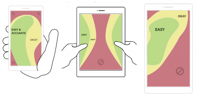
Next time you pick up your mobile device, take a look at how you are holding it. Where do your fingers and thumbs rest when they’re not in motion? What part of the screen is the most comfortable for you to tap? Which parts of the screen can you reach with your thumb?
The image below shows those areas of the screen that are easiest to tap when holding a normal size mobile phone or phablet with one hand or a tablet with two hands.

Via: A List Apart
Make sure you place the most common actions in the easy to reach the green zone and place controls such as edit and delete that you don’t want users to accidentally tap in the hard to reach the red zone. User testing should be able to tell you if you’ve been successful.
6. Always test everything you build and look for ways to improve it
When mobile teams think about testing, they often think about quality assurance. They test their app for functional reasons, to eliminate bugs and ensure it works without crashing. But you will want to run several usability tests as well to make sure you can truly satisfy your customers.
One way to test the usability of your app is to perform remote user testing. Remote user tests allow you to get feedback from participants using your product in their natural environment by employing screen recording software.
Remote user testing is like looking over the shoulder of a person using your app. While you aren’t physically in the same room as your test participant, it can be a much faster and more economical alternative to traditional lab usability testing.
While user testing is a great way to find out what users are thinking and feeling as they use your app, you will also want to rely on your analytics for details on how often people complete key actions, tap certain buttons, uninstall your app, and so on. Having both quantitative data and qualitative insights is an excellent way to understand the full picture of your user experience.
Summary
To stay competitive, your mobile experience must delight your users enough for them to try your app and revisit it frequently.
To accomplish this goal, you can start implementing a few “best practices” which are guaranteed to help you execute a great user experience. First, you must design every mobile experience with your users’ goals in mind. What would the user do in any specific scenario and is the proposed solution convenient to the mobile customer? Second, you need to learn and understand how and why mobile interactions are different from desktop or laptop experiences. Doing so and implementing a mobile-friendly strategy will very likely drive up engagement with the app. Third, make sure you test new ideas as frequently as time allows it. You can never learn enough from your customers!
If you implement these strategies, your mobile app will be more engaging and useful to a large number of mobile web customers who will pay back your efforts by often returning, following and completing your desired conversion paths, and increase sales.


